Build a business website that respects mobile data
A practical plan for a faster, clearer website that works for customers on small screens and variable connections.
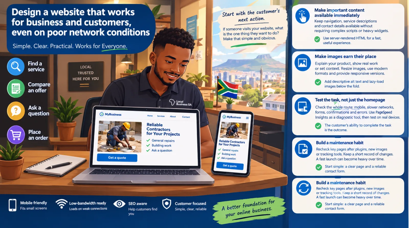
A business website should help someone complete a task: find a service, compare an offer, ask a question or place an order. That task should stay simple when the reader has a small screen or an unreliable connection. For an African business serving customers across different devices and networks, designing for constrained conditions is a useful starting point.
Start with the customer’s next action
Write down the main action for each page before choosing its layout. A service page might need a clear description, a realistic explanation of the process and a contact route. Put those essentials in the page itself. Avoid making someone download a large company profile just to learn what you do.
Use labels a new customer understands. A button called Request a quote communicates a specific outcome. A vague invitation to discover more makes the reader work out what will happen.
Make images earn their place
Use images to explain a product, show real work or establish context. Resize them to the dimensions your layout needs rather than uploading a full-resolution camera file. Export modern formats where your tooling supports them, and provide responsive image sizes so a phone does not download an unnecessarily large desktop image.
Give each image its width and height so the browser can reserve space. Add descriptive alternative text when the image communicates information. Decorative images can have empty alternative text. Load below-the-fold images lazily, while letting the main visible image load normally.
Keep important content available immediately
Server-rendered HTML can give a browser useful text and links before optional scripts finish loading. Make navigation, service descriptions and contact details work without a complex client-side application. Add JavaScript where it improves a real interaction rather than using it for every element.
Review third-party widgets carefully. A chat widget, analytics service, video embed and advertising script each adds work for the browser and may create privacy obligations. Keep only the services you actually use, and obtain consent where required before loading optional services.
Test the task, not only the homepage
Open the website on a phone, use a slower-network simulation and try to complete the customer’s task. Can you read the form without zooming? Does the keyboard cover the action button? Does a failed submission explain how to recover? Check the whole route, including confirmation and error states.
Use PageSpeed Insights to investigate performance issues, then confirm the practical effect on real devices. A score is a diagnostic tool; the customer’s ability to finish the task is the outcome.
Build a maintenance habit
Recheck key pages after adding plugins, new images or tracking tools. Keep a short record of changes and repeat the same task tests. A fast launch can gradually become a heavy website if every small addition is treated as free.
Start with a clear page and a reliable contact form. Improve it using evidence from customer questions and actual use. That gives your website a better foundation than a large collection of features nobody asked for.
Join the conversation
Keep it useful. Comments are reviewed before they appear.